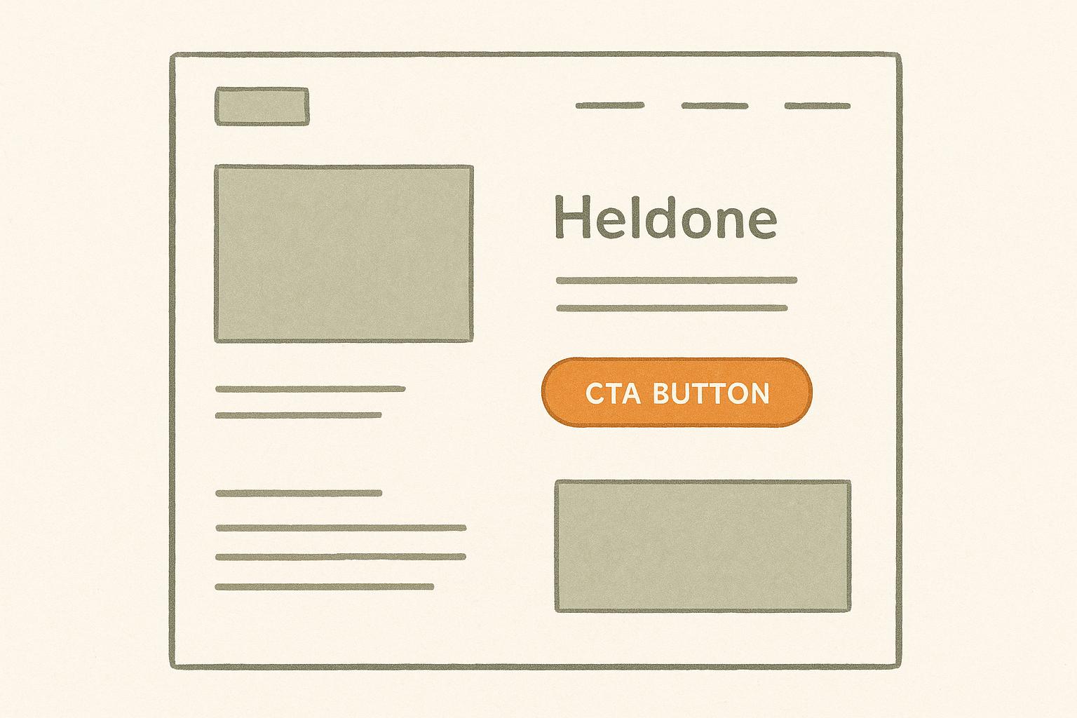
10 CTA Placement Tips for PPC Landing Pages
Want more conversions from your PPC landing pages? Start by nailing your CTA placement. Calls-to-action (CTAs) guide visitors toward taking the next step – whether that’s signing up, downloading, or making a purchase. But where you place them can make or break your results.
Here’s what we know:
- Above-the-fold CTAs grab attention immediately and can boost conversions by 317%.
- Multiple CTAs throughout the page cater to users at different decision-making stages.
- Sticky CTAs ensure your offer stays visible as users scroll.
- Mobile-friendly CTAs placed where thumbs naturally hover can increase clicks by up to 40%.
- Heatmaps reveal where users engage most, helping you refine placement.
CTA placement is not a guessing game. Use data, test different positions, and keep designs simple yet eye-catching. Let’s explore these 10 tips to optimise your CTAs for better performance.
How to design an effective website call to action
1. Place CTAs Above the Fold
The area above the fold – the part of your PPC landing page visible without scrolling – is prime real estate. It commands 57% of users’ viewing time and often determines whether visitors engage with your page or leave within seconds.
Visibility and Accessibility
Positioning your call-to-action (CTA) above the fold ensures it gets noticed right away. Richard Fong from Bliss Drive puts it perfectly:
"Placing CTAs above the fold guarantee immediate visibility and capture user attention quickly."
This is especially important for mobile users, where screen space is limited, and every pixel counts. When users arrive via PPC ads, they’re already in decision-making mode. An above-the-fold CTA taps into that readiness and encourages immediate action.
User Behaviour and Engagement
Understanding how visitors behave on your page highlights why above-the-fold CTAs are so effective. A striking example: 90% of users who read your headline will also engage with your CTA. This creates a seamless flow from initial interest to conversion.
That said, timing matters. If visitors don’t yet understand your offer, a premature CTA might miss the mark. The key is to balance visibility with clarity, ensuring the CTA aligns with the user’s journey.
Design and Aesthetic Appeal
A well-designed above-the-fold CTA grabs attention without overwhelming the user. Use contrasting colours to make it pop, and add ample whitespace to keep the layout clean. Directional cues, like arrows or images, can subtly guide the user’s eye to the button.
Conversion Optimisation
For maximum impact, your CTA should use clear, action-focused language. Avoid vague phrases and opt for text that highlights a direct benefit, like offering a free resource or discount. Experiment with different designs and placements to see what resonates most with your audience.
It’s worth noting that "above the fold" doesn’t mean cramming everything into this space. As Joanna Wiebe from Copy Hackers wisely points out:
"Don’t cram everything above the fold. Visitors are willing to scroll… as long as they know there’s something to scroll down for."
Next, we’ll dive into more layout tweaks to help drive even better conversion rates.
2. Use Multiple CTA Locations
Once you’ve nailed the above-the-fold call-to-action (CTA), you can take your landing page to the next level by strategically placing multiple CTAs throughout. This approach ensures you capture users’ attention at various points in their journey, whether they’re ready to act immediately or need more time to decide.
Visibility and Accessibility
Not everyone interacts with a page the same way. Some users make decisions quickly, while others explore every detail. To cater to both, make your CTAs highly visible and accessible. Use clear, action-oriented language like "Download Free Guide" or "Start 14-Day Trial" instead of vague phrases like "Click Here." Ensure strong contrast between the button and the background, and don’t forget about keyboard accessibility – it’s a small detail that makes a big difference.
User Behaviour and Engagement
How users navigate your page can guide where to place CTAs. Ideal spots often include moments after key benefit explanations, testimonials, or compelling statistics. These are natural pause points where users are more likely to consider taking action.
That said, don’t overdo it. Too many CTAs can overwhelm visitors. Stick to 2–4 placements to keep things clear and focused. As the Bureau of Internet Accessibility advises:
"All applicable digital accessibility guidance should be incorporated when crafting the perfect CTA."
Design and Aesthetic Appeal
Your CTAs should complement the design of your page, not compete with one another. Create a clear hierarchy by making the primary CTA stand out – this could mean using a larger button, a brighter colour, or more prominent positioning. Secondary CTAs should still be noticeable but less dominant, ensuring the page maintains a single, clear goal. Consistency is key: use the same button styles, fonts, and overall design to create a seamless and intentional user experience.
Conversion Optimisation
The placement of your CTAs can directly influence conversions. For instance, placing a CTA prominently boosted a blog post’s revenue by 83%. Experiment with positioning buttons after the headline, following key benefit sections, or at the bottom of the page. Analysing engagement data can help you pinpoint which placements work best for your audience.
Ultimately, effective CTAs don’t just grab attention – they guide users toward the next step with clear value. Place them where they naturally fit, such as after engaging content or near trust signals like testimonials, to encourage action and drive conversions.
3. Position CTAs Near Key Benefits
Place your CTAs right after highlighting key benefits to turn interest into action. When someone reads about how your product can solve a problem or save them time, they’re more likely to take the next step.
User Behaviour and Engagement
Visitors often skim landing pages with one key question in mind: "What’s in it for me?". They’re on the lookout for benefits that address their needs. By positioning CTAs immediately after these benefit-driven statements, you meet them at the height of their interest.
Studies reveal that click-through rates can increase by up to 47% when CTAs emphasise user benefits. Additionally, customised CTAs convert 42% more visitors. This means your CTA should reflect the benefit you’ve just presented. For instance, if you’ve highlighted time savings, a button saying "Start Saving Time Today" will resonate far more than a generic "Sign Up Now".
This smooth transition from benefit to action makes the user’s journey feel natural and persuasive.
Conversion Optimisation
Aligning CTAs with user benefits is a proven way to boost conversions. In fact, focusing on benefits rather than just listing features can improve conversion rates by 31%.
Brands like HubSpot and BarkBox have successfully used tailored, benefit-focused CTAs to drive results .
To make the most of this strategy, clearly state what users will gain by clicking. Whether it’s saving time, improving a skill, or unlocking exclusive content, the benefit should feel immediate and enticing.
Design and Aesthetic Appeal
Design matters when linking benefits to CTAs. A well-organised layout should naturally guide the eye from the benefit statement to the CTA button. Use techniques like bold text or italics to emphasise key points, and ensure the button itself stands out with contrasting colours and ample white space.
The goal is to create a seamless visual flow that connects the benefit directly to the action you want users to take.
4. Add Floating or Sticky CTAs
Floating or sticky CTAs (call-to-actions) stay visible as users scroll, making it easier for them to take action at any moment during their visit.
Visibility and Accessibility
On longer landing pages, static CTAs can easily go unnoticed as users scroll. Floating CTAs solve this problem by remaining visible, which is especially helpful on mobile devices. To make them effective, place them thoughtfully – keeping them accessible throughout the user’s journey without overshadowing important content.
User Behaviour and Engagement
Sticky CTAs match how users naturally interact with a page. When someone is ready to take the next step, they shouldn’t have to search for how to do it. Having the CTA always within reach can increase engagement and lower bounce rates. Fine-tuning the design ensures it grabs attention without being a nuisance.
Design and Aesthetic Appeal
For a floating CTA to work well, it needs to stand out while blending with your overall design. Use colours that contrast with the rest of the page but still align with your brand. Subtle animations or transitions can help catch the eye without feeling overbearing. Make sure the CTA is optimised for all devices, balancing its size and spacing, and use ample whitespace to keep it visually appealing.
Conversion Optimisation
Sticky CTAs reduce friction, allowing users to act the moment they’re ready. Experiment with different placements – such as the header, footer, or as a floating element – to see what works best. Tools like A/B testing, heatmaps, and session recordings can help you refine your approach. These elements fit seamlessly into your PPC landing page strategy, ensuring your CTAs are always in reach and driving conversions effectively.
5. Optimise CTA Placement for Mobile
With mobile devices driving 63% of web traffic, ensuring your PPC landing pages are mobile-friendly is no longer optional – it’s a necessity. Considering there are around 4.88 billion mobile users globally, getting your call-to-action (CTA) placement right can make a huge difference to your conversion rates.
Visibility and Accessibility
Mobile screens demand a different approach to CTA placement compared to desktops. Since 75% of users interact with their phones using only their thumb, it’s essential to position CTAs where thumbs naturally rest – typically in the lower third of the screen.
"Mobile CTA Interaction Ease is a metric that assesses how effectively users can interact with call-to-action (CTA) buttons on mobile devices. It focuses on the accessibility and usability of these elements, particularly within the reach of a user’s thumb." – landingmetrics.com
This insight highlights the importance of thumb-friendly design. For example, the SimScale Energy landing page scores a perfect 100/100 on Mobile CTA Interaction Ease by placing its CTA prominently above the fold and within easy thumb reach. Similarly, Indeed for Employers achieves the same score with a wide, easily tappable CTA button. In contrast, the Huawei Mate X3 landing page scores only 33/100 due to a poorly placed "Buy" button that’s hard to reach and has a small clickable area.
User Behaviour and Engagement
Mobile users behave differently than desktop users. For instance, 57% of browsing time is spent at the top of mobile pages, but mobile users tend to scroll to the bottom before deciding to leave. This means they expect a more tailored experience, not just a scaled-down desktop site. To meet these expectations, consider increasing the frequency of CTAs on mobile pages to minimise unnecessary scrolling.
Design and Aesthetic Appeal
CTA button size plays a crucial role on mobile. Apple advises a minimum size of 44×44 pixels, while Google’s Material Design recommends 48×48 pixels to account for "fat finger syndrome". Buttons placed at the bottom of the screen tend to perform better, receiving up to 40% more clicks than those placed higher up. To further enhance usability, ensure there’s enough space around your CTA to prevent accidental clicks on nearby elements. Also, avoid letting sticky elements like chatbots or cookie banners block your CTA.
Conversion Optimisation
The rewards of optimising mobile CTAs are clear. A well-designed mobile CTA can increase conversions by 32.5%, while a poor mobile experience can reduce lead quality by up to 45%. Proper placement and visibility can also boost click-through rates by as much as 200%. To achieve these results, use buttons no smaller than 48px, position them where thumbs naturally hover, and always include a CTA at the bottom of the page for users who scroll to the end. Finally, test your CTAs across various mobile devices to ensure they perform well on different screen sizes.
6. Make CTAs Stand Out with Contrast
Visibility and Accessibility
To grab attention, your Call-to-Actions (CTAs) need to stand out, and high contrast is the way to do it. By using contrasting colours, you can not only improve visibility but also guide the viewer’s focus naturally to the desired action on the page. For example, a CTA should have a colour that contrasts sharply with both its background and the text on it. Interestingly, a survey of 500 consumers found that 39% consider colour the most critical visual element of a business’s website. To create this contrast, you could use complementary colours (those directly opposite on the colour wheel) or triadic colours (those spaced one-third of the way around the wheel). This approach lays the groundwork for CTAs that demand attention.
User Behaviour and Engagement
Contrast doesn’t just make CTAs visible – it influences how users interact with them. When a CTA is easy to spot, users are more likely to click. In fact, one study revealed a 35% increase in sales when the CTA colour stood out. A notable example is HubSpot’s A/B test comparing red and green CTA buttons. The red button performed 21% better than the green one, likely because green was already a dominant colour on the page. This shows the importance of considering the page’s overall colour scheme when selecting a CTA colour.
Design and Aesthetic Appeal
While contrast is key, it’s also important that the CTA colour fits your design. Research suggests that colours like orange, blue, red, and green are popular choices for CTAs. However, their success depends on how they interact with the existing colour palette of your webpage. As Ed Leake explains:
"No single colour is better than another. Ultimately, what matters is how much a button colour contrasts with the area around it."
This highlights the importance of creating a cohesive brand colour palette. Your CTA should stand out while still aligning with your brand’s identity.
Conversion Optimisation
Contrast doesn’t just enhance visibility – it can also increase conversions. A CTA’s colour alone isn’t enough; what matters is how it alters the visual hierarchy, drawing attention to the button. For instance, RIPT Apparel saw a 6.3% increase in conversions by switching to a high-contrast yellow ‘Buy Now’ button. When choosing a colour, go for something bold that pops against the background but also ensures the text remains legible. And don’t forget to test your CTAs on both desktop and mobile devices to ensure they’re easy to read and tap, regardless of the screen size.
sbb-itb-dcae4ad
7. Use Heatmap Data to Guide Placement
User Behaviour and Engagement
Heatmaps provide a clear picture of how users interact with your PPC landing pages. These visual tools track clicks, scrolls, and mouse movements, making it easy to spot where users are most engaged and where their attention drops off. Click heatmaps show which elements users interact with the most, while scroll heatmaps reveal how far down the page visitors typically go before losing interest. Additionally, move heatmaps trace mouse movements, highlighting areas where users pause or hesitate, offering valuable clues about their decision-making process.
This data is invaluable for deciding where to place your CTAs (calls to action). Users tend to follow predictable scanning patterns – often in F or Z shapes – when navigating a page. By positioning your CTAs within these natural eye movement zones, you can significantly improve their effectiveness. In fact, placing CTAs in high-engagement areas identified through heatmap analysis can boost click-through rates by as much as 50%. These insights provide actionable steps for refining your page layout and improving conversions.
Conversion Optimisation
Heatmap data doesn’t just highlight where users focus; it can also reveal opportunities for improving conversions. For example, Empathy First Media used heatmaps to analyse their pricing page and discovered that users were highly engaged with comparison tables but rarely clicked the "Sign Up" button. Scroll maps also showed a sharp drop-off just before the testimonials section. By repositioning the CTAs and moving testimonials above the drop-off point, they achieved a 24% increase in conversion rates.
"Heatmaps and session recordings transform abstract analytics into visual insights about real behaviour. They show exactly where your conversion funnel leaks and provide concrete direction for fixing those issues – making them essential tools in your optimisation strategy." – Daniel Lynch, Empathy First Media
Similarly, Taskworld identified a small friction point in their signup process using heatmaps. Fixing this issue took just five minutes and resulted in a 40% increase in conversions. These examples show how heatmap data can lead to quick, impactful changes that drive results.
Visibility and Accessibility
Heatmaps are also excellent for assessing whether your CTAs are visible and accessible. They can reveal if important CTAs are being overlooked in favour of less interactive elements. If click heatmaps show low engagement on a primary CTA, it’s a clear signal to reposition it in a higher-visibility area. Scroll depth data can further confirm whether your CTAs are placed too low on the page. For instance, heatmap analysis often supports the advantage of placing key CTAs above the fold.
U-Digital, a digital agency in the Netherlands, used heatmaps to study user interactions on a client’s mobile product page. They identified several friction points and made adjustments that led to a 21.46% increase in click-through rates. This demonstrates how heatmaps can uncover accessibility issues that might go unnoticed with traditional analytics.
As Angi Bowman from Lucky Orange puts it:
"With a website heatmap, you can uncover hidden visitor behaviour, pinpoint areas for improvement, and implement changes that boost conversions and ROI. Stop guessing – start improving your landing pages today."
When applying heatmap insights, focus on relocating underperforming CTAs to areas with higher engagement. Use scroll depth data to ensure your most important CTAs aren’t buried too low on the page. Monitor the impact of these changes in real time to refine your approach. Sites that use heatmaps and UX design tools often see a 22% higher conversion rate, making this strategy a must for PPC landing page success.
8. Place CTAs After Contact Forms
User Behaviour and Engagement
Users who complete contact forms are already showing a strong level of interest and engagement. By taking the time to share their details, they’ve demonstrated a commitment beyond that of casual visitors. This makes it the perfect moment to present your next call-to-action (CTA).
"A Call-to-Action (CTA) is more than just a button or link; it’s a compelling invitation to the reader to engage, whether that means downloading a resource, signing up for a newsletter, or making a purchase." – Steel Croissant
This transition from filling out a form to engaging with a CTA feels natural and keeps the user’s momentum going, making it a prime opportunity to optimise CTA visibility.
Visibility and Accessibility
Placing CTAs right after contact forms taps into the peak of user engagement. To make sure these CTAs are effective, focus on accessibility: use strong contrast between text and background, and include descriptive text for screen readers. Testing these features with users who have disabilities can ensure your CTAs are inclusive and reach a broader audience.
"A call to action is the most direct way to guide users toward the next step in their journey on your site." – Brett Thomas, Owner, Rhino Web Studios
Design and Aesthetic Appeal
The design of post-form CTAs is key to keeping users’ attention without overwhelming them. Use clear visual elements and interactive features to make the CTA stand out, while maintaining a clean, uncluttered look. Thoughtful use of whitespace and balanced text spacing can help the button grab attention without appearing too busy. Subtle animations or directional cues can also guide users naturally toward the CTA.
Conversion Optimisation
Adding a CTA immediately after a form leverages the user’s momentum, encouraging them to take the next step. Action-oriented phrases that create a sense of urgency can boost clicks, but it’s crucial that the CTA delivers on its promise to maintain trust. Experiment with different placements – whether it’s an immediate CTA or one that follows a brief confirmation message – to find what works best for your audience. This approach ensures your CTAs are strategically placed to maximise conversions, aligning with the overall goals of your PPC campaigns.
9. Customise CTA Placement by User Type
User Behaviour and Engagement
Not all visitors are the same, and neither should your CTAs be. First-time visitors often need more context and information to feel comfortable taking action, while returning visitors might already be primed to convert. Recognising these behavioural differences is crucial for placing CTAs effectively.
"Don’t guess what your users want, watch what they do. Use tools like heatmaps and session replays to see where they click, hesitate, or drop off. Pair that with direct feedback from on-page surveys to uncover what kind of CTA actually fits their mindset. Data beats assumptions every time." – Swami, Swipepages.com
Top-of-funnel users typically require softer CTAs embedded within informative content, gently nudging them towards the next step. In contrast, bottom-of-funnel users are more receptive to bold, direct prompts that encourage immediate action. By tailoring CTA placement to these user types, you can create a smoother and more effective conversion journey.
Conversion Optimisation
Building on the behavioural insights above, customised CTAs can deliver impressive results. Personalised CTAs have been shown to perform 202% better and convert 42% more visitors.
For example, Campaign Monitor increased trial sign-ups by 31% by using dynamic CTAs tailored to user behaviour and referral sources. Device-specific adjustments also matter – a CTA optimised for mobile users, placed within thumb-reach zones, will perform better than one designed for desktop layouts. On desktops, CTAs in sidebars or other prominent areas tend to work well, but these placements might not translate effectively to smaller screens.
A case study by conversion expert Michael Aagaard illustrates this perfectly. By simply relocating a call-to-action button to the bottom of a long-form landing page, he boosted conversions by an astonishing 304%. This reinforces the importance of aligning CTA placement with how users engage with your content.
Up next, let’s explore how design choices can further enhance CTA performance.
Design and Aesthetic Appeal
Design plays a critical role in how users perceive and interact with CTAs. The preferences of new and returning visitors often differ: new visitors respond better to subtle, integrated CTAs that blend seamlessly with the content, while returning visitors are more likely to engage with bold, high-contrast designs.
Geography can also influence design preferences. For instance, users in the UK might favour certain colour schemes or button styles that resonate culturally, making localised testing a smart strategy for international campaigns.
The goal is to match your CTA design to user expectations at different stages of their journey. Early-stage users may appreciate soft visual cues, such as understated buttons with friendly, inviting copy. On the other hand, late-stage users are drawn to more assertive CTAs – think bright colours, sharp contrast, and action-oriented language that grabs attention.
"Make sure your calls-to-action are aligned with your messaging." – Dor Cohen, distribution specialist at Wix
A/B testing is your best friend here. Test variations in button colour, size, and placement across user segments, and track the results separately for mobile and desktop audiences. This approach allows you to fine-tune each experience, ensuring your CTAs are as effective as possible for every type of user.
10. Remove Distractions Around CTAs
A clean and focused layout ensures your call-to-action (CTA) stands out, making it easier for visitors to take the desired action without unnecessary distractions.
Visibility and Accessibility
Every element on your PPC landing page competes for attention. When your CTA is surrounded by unrelated elements, it creates visual clutter that can dilute its impact. This "noise" makes it harder for users to focus on what you want them to do.
"You see, our brains are like computer CPUs. We may think we’re smart, but we have limited processing power and any ‘application’ we run can use it up and reduce our ability to process other applications (e.g. other streams of information)." – Chris Goward, WiderFunnel
To keep your page effective, identify and remove anything that doesn’t serve your primary goal. Large navigation menus, irrelevant text, moving images, or competing offers can all distract users.
Take a step back and evaluate your landing page. Ask yourself: What elements are not helping visitors focus on the CTA? Even seemingly minor distractions can have a big impact on your conversion rates.
User Behaviour and Engagement
Visitors arrive on your landing page with a specific intent, but distractions can quickly derail their journey. When users are overwhelmed by competing elements, it becomes harder for them to process your message and take action.
"Noise and distraction is not just about how many products you have. It’s how busy your layout is, how many competing design elements there are, all asking for attention." – Peep Laja, CXL
The closer users are to converting, the more streamlined your page should be. This is especially critical for PPC traffic, where every visitor comes at a cost. Distractions here don’t just hurt conversions – they waste your ad spend.
Consider conducting a heuristic analysis to identify problem areas. Gather a small group to examine your page systematically. Look for distracting fonts, clashing colours, or secondary CTAs that might pull attention away from your main goal. Even subtle issues, like graphics or testimonials placed too close to your CTA, can divide focus.
Design and Aesthetic Appeal
Visual hierarchy plays a big role in guiding users through your page. If unnecessary elements disrupt this flow, your CTA risks losing its prominence. The goal is to naturally draw the eye to the most important action.
Common design distractions include bright colours on non-essential elements, mismatched fonts, and cluttered layouts. For instance, secondary CTAs in bold colours might seem like a good idea to capture different intents, but they often confuse users about what to do next.
Simplify your design by toning down or removing elements that don’t directly support conversions. This could mean using a more cohesive colour palette, reducing the size of secondary elements, or repositioning less relevant information. A clean, focused design ensures your primary CTA stands out and guides visitors seamlessly toward it.
Conversion Optimisation
When a user is close to converting, your page should be stripped of anything that doesn’t directly contribute to that action. The closer they are to checkout or completing a form, the fewer distractions they should encounter.
"Rule of noise: The closer you get to closing the sale, the less things you should have on your screen. Once they get to checkout screen, you shouldn’t have ANYTHING on the page that doesn’t directly contribute to conversion." – Peep Laja, CXL
Start by removing obvious distractions like oversized headers, navigation links that lead users away, or promotional banners unrelated to the main offer. Once changes are made, track how they affect conversion rates. This approach doesn’t just make your page look cleaner – it ensures your CTA gets the attention it deserves and helps maximise your conversion potential.
CTA Placement Methods Compared
Getting your call-to-action (CTA) placement right can heavily influence the success of your PPC campaigns. Each placement method comes with its own pros and cons, shaping how users interact with your landing page.
Static CTAs are positioned in fixed spots like above the fold, within the content, or at the bottom of the page. While placing a CTA above the fold might seem like a no-brainer, it can actually reduce conversions by 17%, challenging the assumption that "higher is always better."
Floating or sticky CTAs, on the other hand, stay visible as users scroll through the page. This constant presence can be particularly effective for longer landing pages, making it harder for visitors to overlook your key message.
Choosing the right method often hinges on your audience and page design. Desktop users and mobile users interact differently with CTAs, especially given the limited screen space on mobile devices. Here’s a breakdown to help you weigh your options:
| Placement Method | Visibility | User Experience | Best For | Potential Drawbacks |
|---|---|---|---|---|
| Static Above Fold | High initial visibility | Feels natural and non-intrusive | Short pages, quick offers | Can reduce conversions by 17% |
| Static Within Content | Contextual visibility | Blends seamlessly with content | Educational or longer pages | Might be overlooked by skimmers |
| Static Bottom of Page | Visible to engaged users | Unobtrusive | Blog posts, detailed content | Low visibility for quick visitors |
| Floating/Sticky | Constant visibility | Can feel intrusive if overused | Long pages, mobile users | May seem annoying if poorly implemented |
Mobile optimisation adds another layer of complexity. With 53% of mobile users leaving sites that load in over 3 seconds, your CTA placement needs to be quick to grab attention and easy to interact with. Floating CTAs often perform better on mobile since they remain accessible without requiring users to scroll back to the top.
Understanding user behaviour is crucial for effective CTA placement. Heatmap tools can reveal high-engagement zones on your page, helping you strategically position CTAs where users are most likely to notice them. For floating CTAs, keeping them subtle – taking up less than 5% of the screen and using gentle animations – can make a big difference.
Testing your CTA placement is equally important. Small changes can lead to huge results. For example, the flight deal alert service Going increased conversions by 104% simply by tweaking their CTA text from "Sign Up For Free" to "Trial For Free".
"A call to action (CTA) is the most important part of a PPC landing page. It’s what converts visitors into leads and drives your conversion goals."
- Samuel Edwards, Chief Marketing Officer
Ultimately, your CTA placement should match your landing page’s purpose and your audience’s behaviour. Short, streamlined pages may benefit from static CTAs in key spots, while longer, content-heavy pages often see better results with floating elements that guide users through their journey.
Conclusion
To make the most of the strategies outlined earlier, effective CTA placement hinges on truly knowing your audience and relying on data-driven decisions. Success comes from treating CTA placement as a continuous process rather than a one-off task. Regular A/B testing of placements, colours, and messaging ensures your landing pages remain focused on conversions and stay relevant over time.
Heatmaps can be a game-changer, showing exactly where users click, scroll, or linger on your page. This eliminates much of the guesswork in deciding where to position your CTAs. Pair this with AI-powered personalisation that adjusts CTA placement based on user behaviour and device type, and you can create experiences tailored to meet each visitor’s specific needs.
Keep an eye on key metrics like CTA click-through rates, conversion rates, and scroll depth. These will indicate whether your current strategy is hitting the mark. If the data suggests otherwise, don’t hesitate to tweak your approach. And if tracking these metrics feels overwhelming, seeking expert advice can simplify the process and help you optimise effectively.
While CTA optimisation is vital, it’s just one part of the bigger picture. The entire user journey – from the moment someone clicks on your ad to when they convert – needs to flow seamlessly. For those looking to fine-tune their PPC campaigns and boost conversions, The PPC Team offers a free audit to identify areas for improvement. It’s a great way to ensure your advertising budget delivers the best possible results.
FAQs
How can I use heatmap data to find the best spots for CTAs on my PPC landing page?
Heatmap data reveals the spots on your landing page where users are most likely to click, hover, or scroll. These high-activity areas are perfect for placing Calls-to-Action (CTAs) to grab attention and encourage conversions.
Pay special attention to consistently active zones, like the area above the fold or near important content sections. Adjust your placements based on how users interact with your page. By reviewing heatmaps regularly, you can fine-tune your approach and boost your page’s effectiveness.
How can I optimise CTA placement for mobile users to boost conversions?
To boost conversions on mobile devices, focus on using large, touch-friendly buttons that are easy to tap and stand out clearly. These buttons should be placed where users naturally direct their attention – like near the top of the page or right after important content sections.
Keep your CTAs consistently positioned to match key decision points along the user journey. Avoid adding them too early, when users might not be ready, or too late, where interest could wane. Also, ensure they’re visible without excessive scrolling, as mobile users prioritise convenience and speed.
How can I make my CTAs stand out without disrupting the design of my landing page?
To ensure your CTAs catch the eye without clashing with your landing page design, go for contrasting colours that draw attention while still blending harmoniously with your overall colour palette. Pair this with bold, legible fonts to make the text instantly readable.
Position your CTA above the fold so it’s one of the first things visitors see. Surround it with ample white space to maintain a clean and organised look. This creates a natural visual flow, directing users’ attention straight to the desired action, which can lead to better engagement and higher conversions.